Artist Research
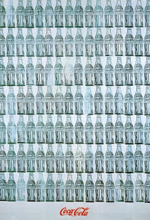
The artist I chose is Andy Warhol. I decided to research his Green Coca-Cola Bottles have always intrigued me from the first time I had seen it. This piece is displayed at the Whitney Museum of American Art. Although this piece is only depicting Coca-Cola Bottles it still makes the viewer think and wonder why Warhol had taken 112 bottles and lined them up in a way that made the viewer ponder what the message is. These bottles are depicted on oil and canvas. Warhol had done the piece in 1962. Warhol presents the bottles in 7 rows or 16, and many of the bottles are more faded than others which I find very intriguing.
To me the piece means that although the bottles are all empty you are still left with a physical object when finished with the what is inside the bottles. When some of the bottles are fade I feel like that represents the act of throwing away a bottle when what is inside something is all gone. The first time I saw this in person it makes you look at the whole image not just a single bottle. If you look at a single bottle I feel like you are losing the full meaning of what Andy Warhol was trying to do. This piece is just very pleasing to the eye with the bottles line up perfectly in each row.
"In 1962, Pittsburgh native, Andy Warhol, created a piece that he entitled Green Coca- ColaBottles. This painting is composed of 112 empty green glass bottles of Coca Cola, lined up into 7 rows of 16. These bottles are set on a white background. Furthermore, at the very bottom of the canvas there is the coca cola logo that is perfectly centered. Moreover, the space in Warhol’s piece is mostly taken up by the empty green glass bottles. However, the entire negative space in between and around the bottles allow the eye to travel through the work. In this work, there is no movement due to the static repetition of the bottles. The manner in which these bottles are placed, in rows, structure the way the viewer will admire the piece. The eye will follow the rows from left to right and from top to bottom. However, the visual path tends to break when our eye comes into contact with a lighter coloured bottle. Also, the order and structure of this piece is a display of balance. In addition, there is a high visual contrast, between the crisp white background and the cleanly traced green strokes of the empty iconic glass bottle. In fact, the green and white also compliment and intensify the red logo. To further this analysis, one can associate the dark green colour with money and the bright red Coca Cola logo as a symbol of power. In tail, the mood evoked from this piece is more of a message toward the viewer of money and power. This artwork comes across mostly as an advertisement, which representative of the Pop Art movement."


Comments
Post a Comment